# announcement
The New Anime Anthology
I'm sure all of you have noticed the minor major changes we've made the website. There will still probably be a couple changes happening here and there, but nothing too crazy. This new layout change is actually the reason why I've been lagging behind on the reviews and general posting. I've spent quite a few hours, days, weeks, and I guess you could even say months trying to get this exactly the way I want it. I figure that I'll never see my website as "perfect" which to me is a good thing. I want to make changes, updates, and keep things looking to the future.
I would go over the layout like I did the last time, but I'm hoping that people understand it without explanation. I tried to make it as stream line as possible to get to reviews, impressions, previews, and miscellaneous posts. It breaks everything down so you get the information you're looking for faster instead of going through tons of different posts or seeing ones you didn't care so much about. I also tried making it easier to contact and send feedback by adding a quick little Feedback section at the bottom of the page. Simply type your name and message and I'll read the email as soon as possible.
Anyway I hope you like the new layout!
-Sid
Read more...
Major Website Changes!
Hey guys! After the long awaited theme update it finally been released November 15, 2011 at 4:02AM. Boy was it a struggle, and trust me it isn’t complete just yet! Why did I release it before the 100%, finished design? That’s simple. I wanted people to get used to the new layout and any minor tweaks and changes wont cause any strange ruckus among the readers. So let’s jump right onto the new look and features this blog has to offer.
Navigation
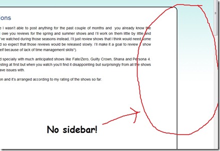
As you can see the navigation has changed considerably, but don’t worry all your favorite links and important information is still right on the main page. The biggest change you may notice is the lack of a sidebar! My, what is this? No sidebar on an anime blog? This is madness! I decided that I wanted to really focus the attention on the posts, which is what I’m sure most of you come to see. The sidebar offered a lot of great tools and tricks to but ultimately was more of a storage space. Now all of the content that was on the side has been pulled into the center or completely scrapped. That isn’t to say that everything will be completely gone forever! I may decide to add a few things later.
Next shift you eyes back up the top of the page to the new navigation bar. Looks pretty plain and simple right? And probably resembles the original design with a bit of color changing. However, you look closely, or rather hover your mouse over a couple of the links you will see that it is now the long awaited dropdown menu. I’ve been playing with this idea for a long time but couldn’t quite get it working on the old site. With a completely revamped theme I was able to create the dropdown menu for more links and better organization. It provides all the main links that most people tend to look for such as Reviews, Season Preview, and Recruiting (ok admittedly the last one is a hope). Now you can jump from one page to another in a snap without having to backtrack.
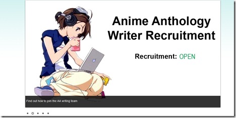
Moving further down on the main page you will see a slick and sexy image slider. This image slider consists of a lot of important links such as an archive to the latest news, recruitment status, link to the season preview, archive of podcasts, and character of the month. Currently the Character of the Month image only links to the archive of characters, but that will change once a new idea is implemented (but that’s a secret for now ;) ). The images may be subject to change as I am a horrible artist and need to improve my graphic skills. Some of you maybe thinking that there are a lot of redundant links between the navigation menu and slider. That’s because I don’t want you guys to think you NEED javascript enabled to get full functionality of the website. Although it may not look as pretty, you wont be missing out on anything.
Note: If you want to create some graphics for the new slider by all means do! Just send me an email and I’ll give you the specifics (such as dimensions and available features).
Layout
Jumping all the way to the bottom of the page you may notice a new feature. Recent comments! The recent comments will give you quick access to the hottest topics and discussion going on in Anime Anthology. And if you have a cute little gravatar matched with your comment people will get a quick look at that as well. It’s a pretty solution to better discussion.
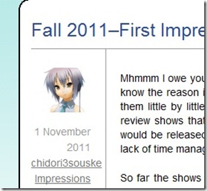
Now if you look to your left you will notice a unique avatar, date, author name, and category. The avatar is a quick way to spot who the post is by. And if you really enjoy the writers style of writing you can click on their name to get an archive of all posts by them. I figured some of you may be digging for more of chidori3souske’s amazing writing skills ;).
Well guys that concludes the quick tour of the new layout and I hope you all enjoy it! If you have any questions concerns, or found any bugs please leave a comment on this post letting me know. And don’t forget, Anime Anthology is an ever growing blog looking for fresh writers so why not find how to become a writer.
Read more... LinkKicking It Off
Well guys the website has just been made and reviews will be coming in shortly! Working on a few right now actually. So I want to welcome you all to the new website and hope you enjoy your stay! Any comments and questions just leave them here and I will be sure to answer them ASAP. If you have an interest in becoming an anime reviewer just let me know by sending an email to szaveri@breakingtheboundary.com. Make sure to check out, register, and post on the forum as well! We hope to have a very open air community here at Breaking the Boundary. See ya! Read more...
Link


